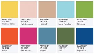
There’s been a lot of buzz around the color Greenery, a.k.a. Pantone’s color of the year. It’s understandable, as making this selection is no small feat. Pantone combs the world looking at every conceivable color influence. Everything from the entertainment industry to art to technology, as well as socio-economic and environmental conditions is carefully considered so that the ‘chosen one’ reflects the world we are living in. What’s more, its selection is far-reaching, as it influences multiple industries such as accessories, apparel, beauty, interiors, paint, home goods, lighting and so much more.
 That said, some years the color of the year isn’t the easiest one to wear. This is one of those years. While very pretty, this particular shade of green has quite a bit of yellow to it. When worn close to the face, it can make some of us look less-than-well. (Notice my diplomacy here.) The good news is that each season Patone gives us 10 colors to choose from. So while this particular shade of green may not be your cup of tea, you’ve got 9 other hot hues to choose from. Not sure what’s right for you? Read on for my take on the 5 most wearable colors of the season.
Island Paradise – Nothing gives a nod to warm weather like this shade of aqua blue. Wear even a small accent of this color and you get a sense of peace and tranquility. I love this color for a flowy blouse, summer-weight sweater or transitional pashmina. If the color itself feels too ethereal, consider grounding it with your favorite black bottom or wearing it in a print. This color offers a wonderful opportunity to embrace the feeling of spring, even if it’s still several weeks away.
Niagara – This color may feel familiar to you, as a version of it probably lives in your closet. This classic “denim-like” blue is not only easy to wear and pair, it sends a message of ease and relaxation. Because this spring denim is hotter than ever, this color is easy to adopt. Whether you sport it in head-to-toe denim (an important trend this spring) or simply pair your structured blazer with a chambray shirt, this trend color will be one to wear long after the season is over.
Hazelnut – Who doesn’t love a great neutral? It pairs effortlessly with any other color (even other neutrals) and provides a wonderful canvas to show off your most fabulous accessories. This spring why not step away from black and embrace the season’s newest neutral? Think of Hazelnut as khaki 2.0. (I’m not sure why we ever stepped away from Khaki, but it’s back with a vengeance!) Look for Hazelnut pant options in slim to wide-leg silhouettes. And if you’re a fan of the shirt dress, you’re in luck as this season there are some great Hazelnut options. And let’s not forget the khaki (oops…I mean Hazelnut) trench that’s already hanging in your closet.
Kale – I know what I said earlier about green. But Kale is actually closer to a military green and acts like a pseudo-neutral, meaning that there’s not a color that won’t work with it. I’ve seen warmer and cooler versions on the selling floor, so you are sure to find a Kale color that flatters your skin tone. This season Kale has been rendered in everything from a casual bomber jacket to an A-line skirt to cargo pants. And let’s not forget its appearance in many of this season’s playful camo prints
Lapis Blue – Bolder than navy but less understated than royal, this mid-tone blue may be just the infusion of color your wardrobe needs. Inspired by the stone lapis lazuli, this blue shade is confident and bold so your comfort zone is important. If you are a less-is-more kind of gal, opt for it in a strand of beads or a classic carry-all. But if you delight in brights, consider this color for a blazer, blouse or dress. Note: this hot hue has been spotted in some of the most spirited stripe prints of the season.
A change of seasons is always exciting, especially when we’ve got a new palette of colors to play with. So why not experiment and have fun? Whether it be greenery or one of its on-trend color counterparts, here’s to discovering a whole new hue!


