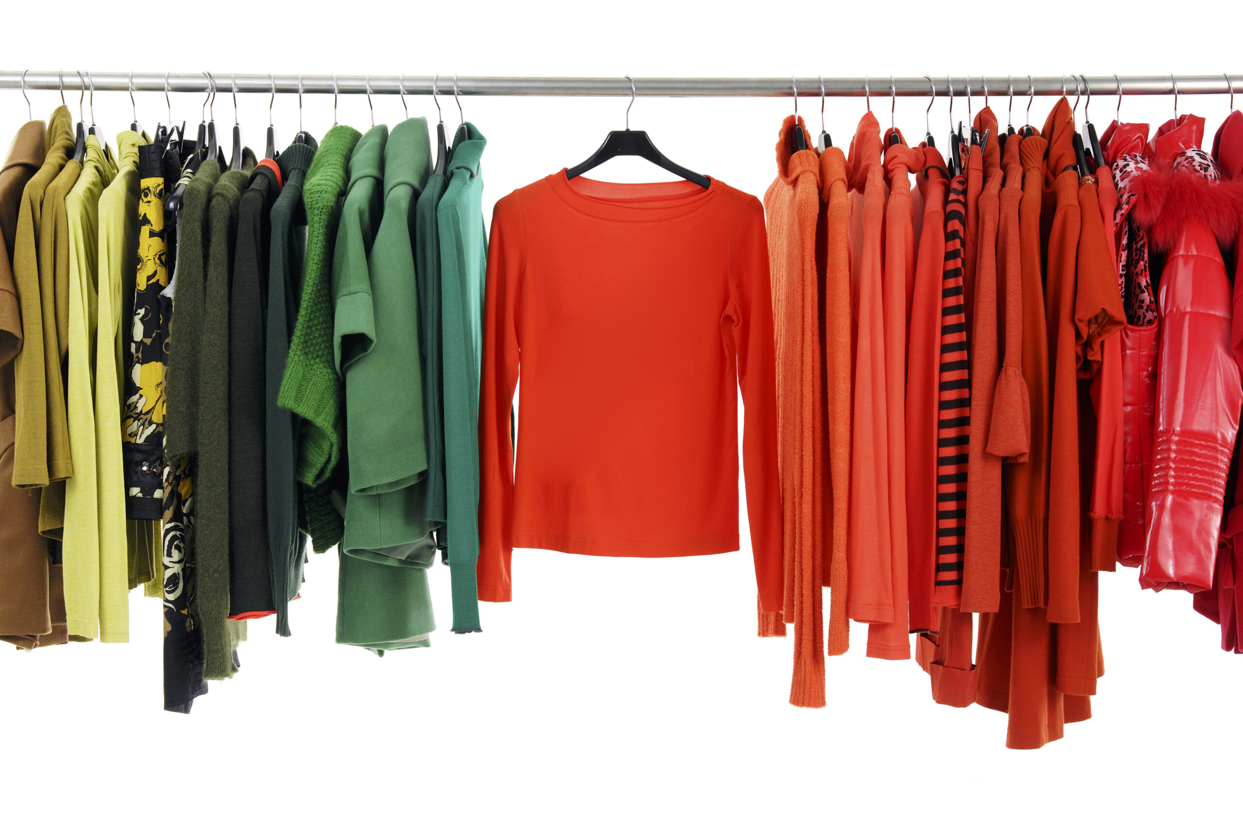
Just like in the dating world… sometimes we like a color that is simply no good for us. For instance, I’m crazy about one of this season’s hottest hues – spicy mustard – even though I know that it’s not great with my coloring. Sure this season there are a whole host of gorgeous colors to choose from. Yet the heart wants what it wants and I still find myself gravitating to this shade of mellow yellow whenever I shop. I know I’m not alone. Sometimes we can’t break the attraction to a color that speaks to us. And the good news is that we don’t have to. With a few helpful hints, we can still wear a color that resonates more with our heart than our complexion. Read on for details.
Better on bottom: The colors you wear closest to the face are the ones that reflect upward and affect how you look. Obviously the goal is to pick colors that make us look healthy, well-rested and vibrant. It’s great when these colors align with the colors we like but what happens when they don’t (like me and spicy mustard)? Simply wear the challenging color away from your face, on your lower half. So go ahead…Flaunt your favorite (but less-than-flattering) hue in a skirt or pant, while placing a more pleasing color close to your face.
Add an accent: By all means add a hint of your favorite hue with an accessory or two. Bags and shoes are a great way to add a pop of color. Ditto for a belt or bangle. Bottom line: sometimes ‘just a dab will do you’ and satisfy your desire to sport your favorite shade.
Play with prints: Since prints often contain multiple colors, look for one that combines some of your ‘technically’ correct colors with others colors that you just love. Make sure that your flattering colors are more dominant by squinting at the print and seeing what colors jump out at you.
Nail it: Long gone are the days when nail color was only red or pink. Each season we have a full spectrum of polish colors to choose from, including the Pantone trend colors. Nail polish companies like Deborah Lippmann, Butter and OPI take pride in offering a vast array of-the-moment hues. So why not experiment and have fun with this low-commitment, low-investment, temporary try?
Live in color: Make a challenging color your go-to hue by placing it all around you. From paint and throw pillows, to mugs and vases, to bathroom accessories and bedroom lamps… Be creative and don’t comprise on the hue that’s just so you!
Note: Are you color-confused? Don’t despair. I can help you ID your best colors and how to best to wear them. Just shoot me an email (info@caroldavidson.com) or give me a call to discover a whole new hue!